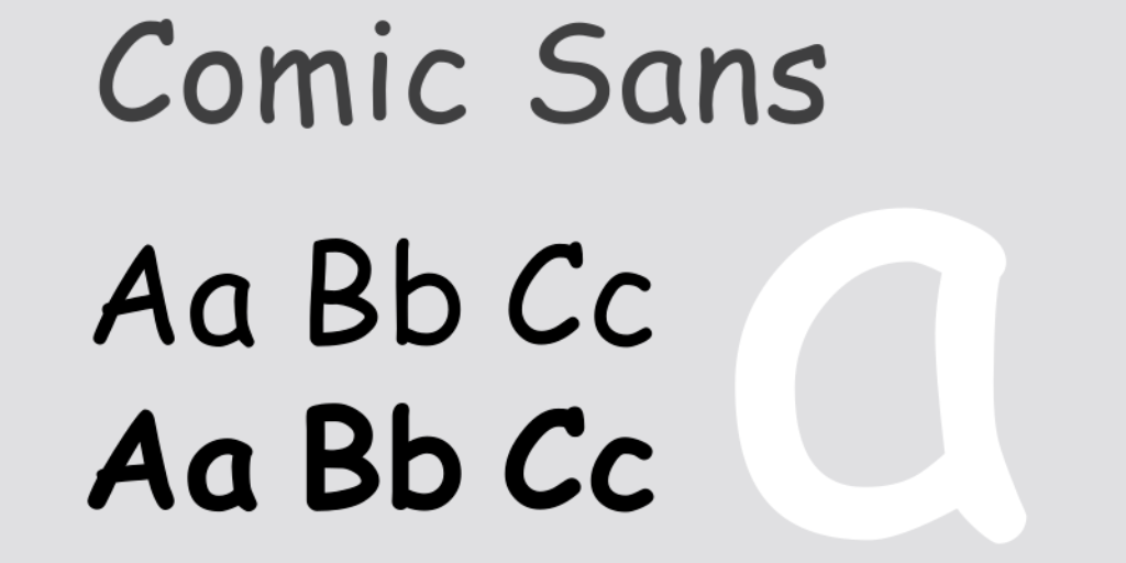
Today we’re celebrating Comic Sans, the font everyone loves to hate
Lesson summary
Hi there everyone, I’m Jeff and this is Plain English, where we help you upgrade your English with current events, trending topics, or whatever happens to be in my mind when I sit down on a Friday to write the content.
Every now and then I make an episode about something that just makes me laugh—and that’s what I’m doing today. The first Friday in July is Comic Sans Day, so that will be tomorrow, July 7, 2023. According to the official description, Comic Sans Day is celebrated across the world as “a way to laugh about and appreciate this overused and universally hated font.”
This is lesson 587 of Plain English and the full lesson can be found at PlainEnglish.com/587. In the second half of the audio, I’ll show you what it means to “play a role in” something. And we have a song of the week. Let’s get going.
Comic Sans: the font we love to hate
Typography plays a role in how we perceive written communication. Most of us don’t pay too much attention to choices of fonts and typefaces; it’s just a background part of the world we live in.
But somehow it’s different when we see something written in Comic Sans.
Comic Sans was developed by a Microsoft designer named Vincent Connare. His inspiration was comic books. In a comic book, characters “speak” through quote bubbles. And in comic books, the lettering of the speech is informal, uneven, imperfect, childlike, as if it were written with a pencil that needs sharpening.
Comic Sans brings that childlike look to computers. Professional designers have criticized Comic Sans as a typeface. They say the spacing between the letters isn’t even. The weight of the strokes forming the letters—also not consistent. When you look at it, something looks a little…not right.
But the funny thing is: this was done on purpose. In the early days of Microsoft Windows, the company was trying to create a computer-based user guide that would help consumers learn how to use Windows. They used a cartoon dog called Rover to teach customers what to do and where to click in Windows—and Rover had speech bubbles, like in a cartoon. Comic Sans was developed to represent the words of the talking dog Rover in the gamified Windows user guide.
If you think about it that way, Comic Sans did its job perfectly. It’s silly, it’s cute, it’s the typeface you would imagine a talking dog would use. The Microsoft user guide wasn’t a success—not many Windows users ever had the privilege of meeting Rover, the talking dog.
But the user guide did leave a lasting legacy. Comic Sans was included in every copy of Windows 95 and every copy of Windows since then.
And it has inspired controversy like no other font in the history of personal computing. Designers say that when you use Comic Sans, you’re communicating that what you’re writing isn’t serious. So it’s especially tragic—or funny?—when someone uses Comic Sans in a situation that really should be serious.
Comic Sans is good if you want to inject a little personality into a non-serious thing—if you’re advertising a bake sale, for example, or printing invitations to a child’s birthday party. It’s not good if you want to communicate something serious.
That hasn’t stopped people from using Comic Sans in official documents, in corporations, in government, on signs. A sign advertising a domestic violence hotline—Comic Sans. Safety warnings—Comic Sans. One funeral home printed its detailed invoice in Comic Sans. A scientific conference announcing the discovery of the Higgs boson—a major breakthrough in physics—also used Comic Sans.
In all these cases, people chuckle; they snap pictures with their phones and they laugh at how inappropriate it is. But consider a few famous cases where Comic Sans was used—and not for comic relief .
A World War II memorial in the Netherlands inscribed the names of fallen soldiers in Comic Sans, attracting complaints from Jewish organizations. In Chile, a former president was honored with a statue and an engraving in Comic Sans, drawing ridicule on social media.
The most famous example of Comic Sans appearing in an inappropriate place came in 2010. The basketball star LeBron James had decided to leave his hometown Cleveland Cavaliers in favor of the Miami Heat.
This infuriated the city of Cleveland—fans burned LeBron jerseys. They felt betrayed. The owner of the Cleveland Cavaliers, Dan Gilbert, released a blistering letter. He called LeBron’s move a “shocking act of disloyalty.” He called it a “heartless and callous action.” He promised Cleveland would win a basketball championship without LeBron James.
The words channeled the anger and betrayal that most Clevelanders felt. But the letter was written in Comic Sans. The internet exploded in ridicule. How could you take it seriously, people asked? Here was the owner of a basketball team—a billionaire real estate developer—expressing anger and betrayal in a typeface for children!
For a time, on Twitter, criticism of Comic Sans in Dan Gilbert’s letter was briefly more intense than criticism of LeBron’s decision to leave Cleveland.
There developed a niche industry to poke fun at this font. A couple of graphic designers started a partially-serious movement to ban Comic Sans. There was a Comic Sans joke in the TV show “Parks and Recreation.” There’s a Croatian movie about a graphic designer—the movie is called Comic Sans. And there’s even a song named for the typeface. “Comic Sans is the best font in the world if you want your designs to look like they’re done by little girls,” the song goes.
But for all the ridicule this typeface gets, there are some admirers. In the Netherlands, two radio DJ’s decided they would celebrate the font on the first Friday of July every year—Comic Sans Day. Some Dutch companies have changed the fonts on their web sites to Comic Sans on that day.
One study showed the font is especially legible for dyslexic readers. Other studies show that if you want people to pay attention to what you’re writing, use Comic Sans: people remember the content more than they would if it were written in a traditional typeface.
Comic Sans in passive-aggressive notes
There was a website, a long long time ago, called PassiveAggressiveNotes.com. And it would be full of photos of passive-aggressive notes people would leave for other people—for neighbors, roommates, office kitchens. Readers would take pictures of these notes and submit them. It was so funny. And the funniest ones were the really mean ones written in Comic Sans—I don’t know why, but it just always made me laugh.
So when I saw there was a Comic Sans Day, I said, I have to do an episode about that.
Great stories make learning English fun

